By Keith Smith, Consultant
I recently had the opportunity to develop an application for the annual QlikView Partner App Contest. After learning about this year’s contest theme, “smart” data visualization, I became excited at the thought of starting with an empty canvas to create an application using a database of my choosing. I’m certainly passionate about applications that combine QlikView’s associative data ability with industry best practices for clean, crisp charts and user interfaces. And now I had the chance to develop an app using whatever data I wanted!
After reviewing the contest guidelines (“smart visualization” object outside of the standard chart types that addresses a need, is unique and innovative, is gorgeous and genius, and is easy to understand and interactive), I immediately began thinking of my hobbies outside of work. Because, while QlikView is an excellent software product for analyzing business data, there is so much more data out there that could benefit by being loaded into an associative data model. My mind was drawn to the piano, with its numerous keys, chords and pitches. Why not develop an interactive piano keyboard inside of QlikView, using musical data? Besides being fun to play with, it could also be educational.
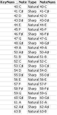
All QlikView apps are built upon data, and this one could be no exception. I pondered the data model that would be required to create a “smart viz” keyboard that would respond to user clicks and display data associations. Wikipedia has a nice list of piano key numbers and their corresponding notes. I made a few adjustments, and ended up with the basic table below. (Contest guidelines required the app to fit within a certain screen resolution, so I only took a small subset of the data in order to make the keyboard fit the screen.)
Next, I found a nice, clean illustration of a piano keyboard.
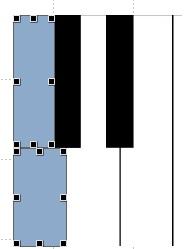
Now…. how to link this image to actual data inside of QlikView? I knew for certain that I wanted each key to be clickable, resulting in both a data selection, and visual confirmation of that selection (for example, changing color). The first approach involved placing transparent, perfectly sized text objects on top of each key, and giving each one of these objects a “Select in Field” action to select corresponding note values upon being clicked. The text objects would then also change color.
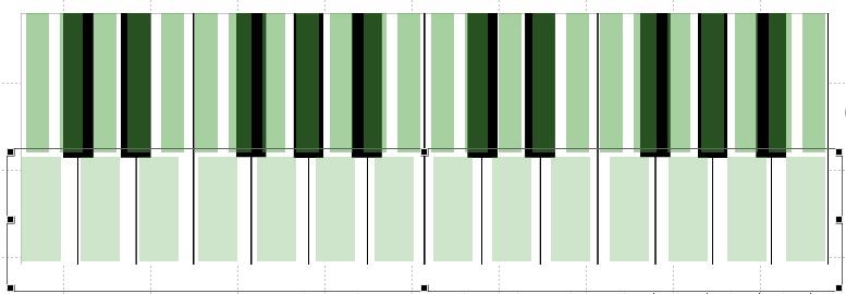
While this approach worked OK, it didn’t provide all of the functionality I wanted. What if the user wanted to play multiple notes at once? Multiple text objects do not support this. What was really needed was the “click and drag” behavior of actual QlikView charts, for example a bar chart, where the user can select multiple values right inside of the object. The natural choice, then, was the standard bar chart, with the following modifications:
- Hidden dimensions, legends, axes, and caption
- Set analysis in the expression to ignore selections in certain fields (the chart needed to display all notes at all times, enabling the user to quickly make selections across the entire keyboard)
- Completely transparent bars. This was best achieved using color variables and the ARGB function. Setting the “alpha” factor (which controls opacity) to 0 resulted in complete transparency. During development, however, I found myself frequently needing to move these objects around. Temporarily assigning the alpha factor to a higher value like 128 made the charts immediately visible, while still preserving a certain degree of transparency. Then, prior to publishing, I switched back to 0.
This approach worked well. Although each bar did not fit perfectly over its corresponding key, it was close enough, and the user never sees the bar chart anyway – they’re just clicking keys (bars).
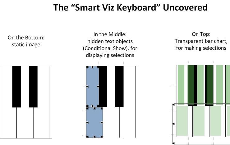
To summarize, then, multiple objects were used to create the keyboard inside of QlikView.
Although fairly satisfied with the application at this point, I started dreaming about what else might be possible. Could we actually program the keyboard to play sounds? I knew the BUNDLE prefix could be used to load external files into QlikView, and that macros could possibly be written to play audio files loaded this way. But the application needed to be fully functional in a web browser, and this was not the best approach. So, I did what I always do while working on projects for Bardess clients – I reached out to a colleague. Our team-based approach to delivering successful projects is one of my favorite things about working at Bardess. We have a deep roster full of skilled, experienced consultants that truly enjoy helping each other.
For this piano keyboard to play audio inside of QlikView, I knew it would likely require an extension object, and so I reached out to one of our best consultants, Jay Jakosky. Not only did Jay provide valuable feedback about the application itself, but he also led the development efforts required to get the audio working. Jay used his home piano to record audio for each note, resulting in 24 mp3’s (one for each key). We think that this is one of the most compelling features of this application – it’s truly data driven. We didn’t include recordings of every possible note combination. QlikView creates those combinations on the fly. Selections (and their corresponding sounds) are completely driven by the user.
We are very proud of this application, and were pleased to learn that it placed in the top 5 for the 2013 Partner Application contest. It was fun to develop and forced us to get creative in order to deliver something new and innovative that had never been seen before. Imagination, and the Bardess team-based approach, contributed to the final version of The Piano Teacher.
Are you interested in learning more about how Bardess can make QlikView work for your business? Contact us today for a free consultation.
About the Author
Keith Smith, a Consultant at Bardess, has been blending business data with cutting-edge processes and technology for the past 15 years. He looks forward to challenging projects that involve delivering the right information, to the right people, at the right time. He is especially interested in data visualization techniques that foster acceptance and comprehension of management performance dashboards.


